Sherpa — Y-Hack 2013
A web-app connecting prospective students with current college students, to provide a genuine account of the student experience.
Y-Hack 2013
In the winter of 2013 I attended Y-Hack at Yale on a team with another designer/front-end dev and two other developers. One member had previously had the idea to create a web app to help prospective college students find the school that best suited them. We could connect high school seniors with college students that had similar interests, who weren’t affiliated with Admissions, and circumvent the school’s hyperbolic marketing. We could create a system that allowed prospective students to schedule visits with college students or arrange for a video call within the app. The app would keep track of all the schools a student was looking at and, via Google Calendar, keep track of scheduling for the high-school students and the college volunteers. It would be a friendly, simple tool that would help ease the stressful process of deciding where to go to school (where one spends a lot of time and money). We decided to call the app Sherpa because our college volunteers would be like guides on this potentially emotionally arduous journey.
The Process
As a team we fleshed out the idea and worked out a set of features from a product design as well as a development perspective. Since we had only 24 hours to build a working prototype we would have to prioritize certain features. We decided to fully build out the process of searching different schools for Sherpas, and booking video calls. We’d also demo a video call in-app and get Google Calendar integration up and running to show how the app would handle scheduling for the Sherpas.
I worked quickly with our other designer to solidify my ideas for how the interactions would work and then got to work in Sketch, mocking up the layout and visuals. I also did a fair amount of front-end development, building out many of the components of the design using Jade and Sass.
Sherpa
Selecting a School
The design of Sherpa makes use of type-aheads and prompts that use natural language to funnel users through the app with as much clarity and as little friction as possible. The landing page contains information about the app but more prominently features a prompt asking the user to input a school they are interested in. A type-ahead then appears based on the entered text, suggesting schools that are in the system.
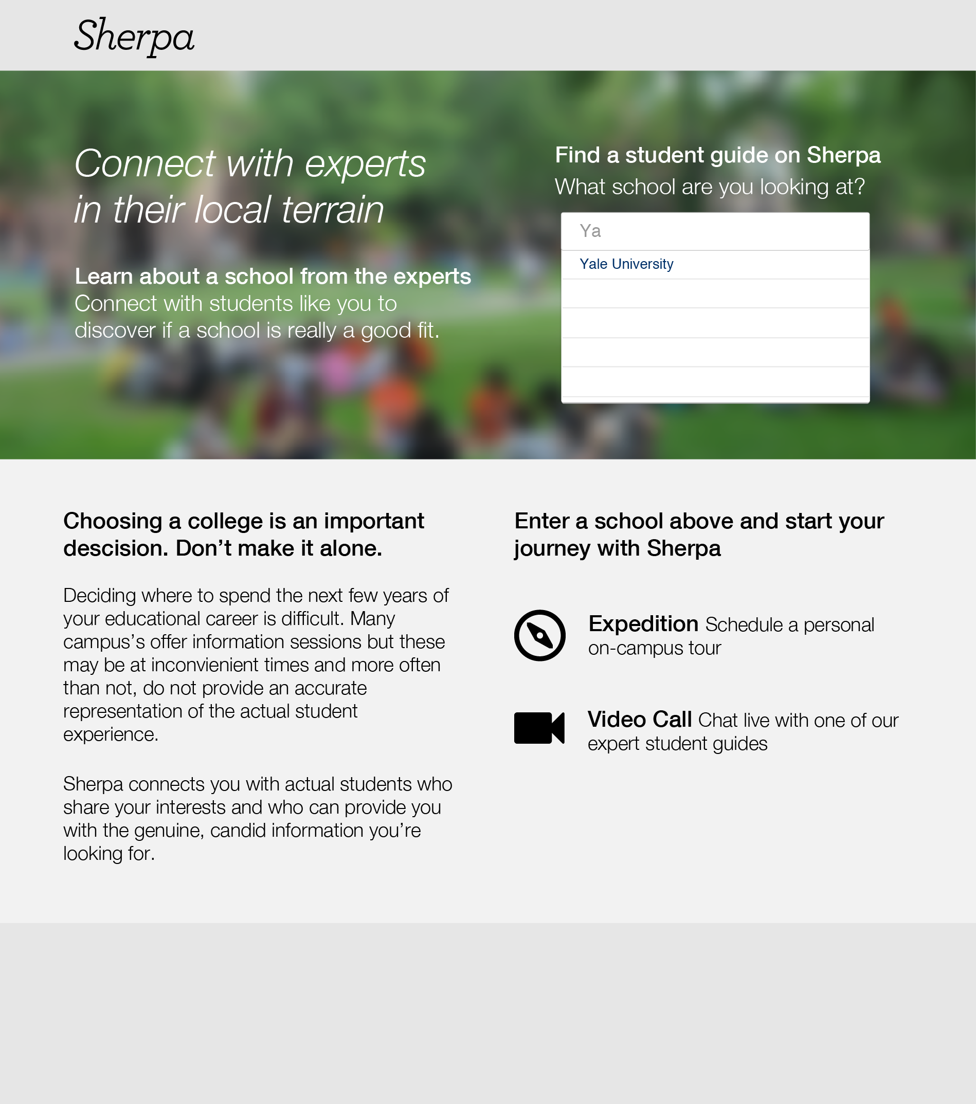
The landing page features a prompt asking the user to input a school they are interested in. A type-ahead then appears based on the entered text, suggesting schools that are in the system.
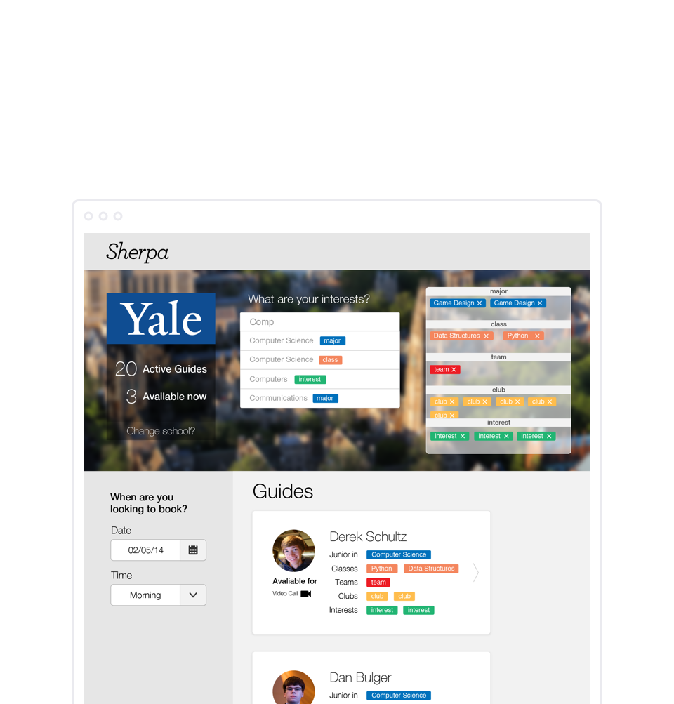
Selecting a Sherpa
Once the user selects a school, they are taken to a page listing all of the active sherpas for that school. The sherpas appear in a list of cards containing information about the guide. Each card lists information about the sherpa’s major, classes, teams, clubs and general interests. The information appears in the form of tags next to each category label. At the top of the page, the user is prompted by another type-ahead to provide their interests. This time, as they type, suggestions appear associated with specific types of tags. As the user selects these tags, they appear in drawers to the side of the type-ahead. These are matched against the sherpa’s tags in real-time in order to filter the list. The sherpa cards also show whether the sherpa can participate in a video call or an in-person meet up (which we call expeditions).
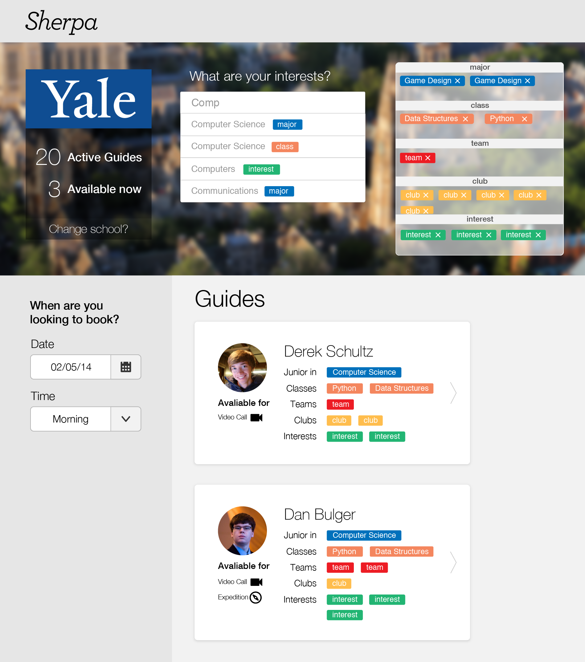
The user provides information about themselves in the form of tags which are matched against sherpa's information in order to filter the list and provide a good match for the user. The user can also change schools directly from this view.
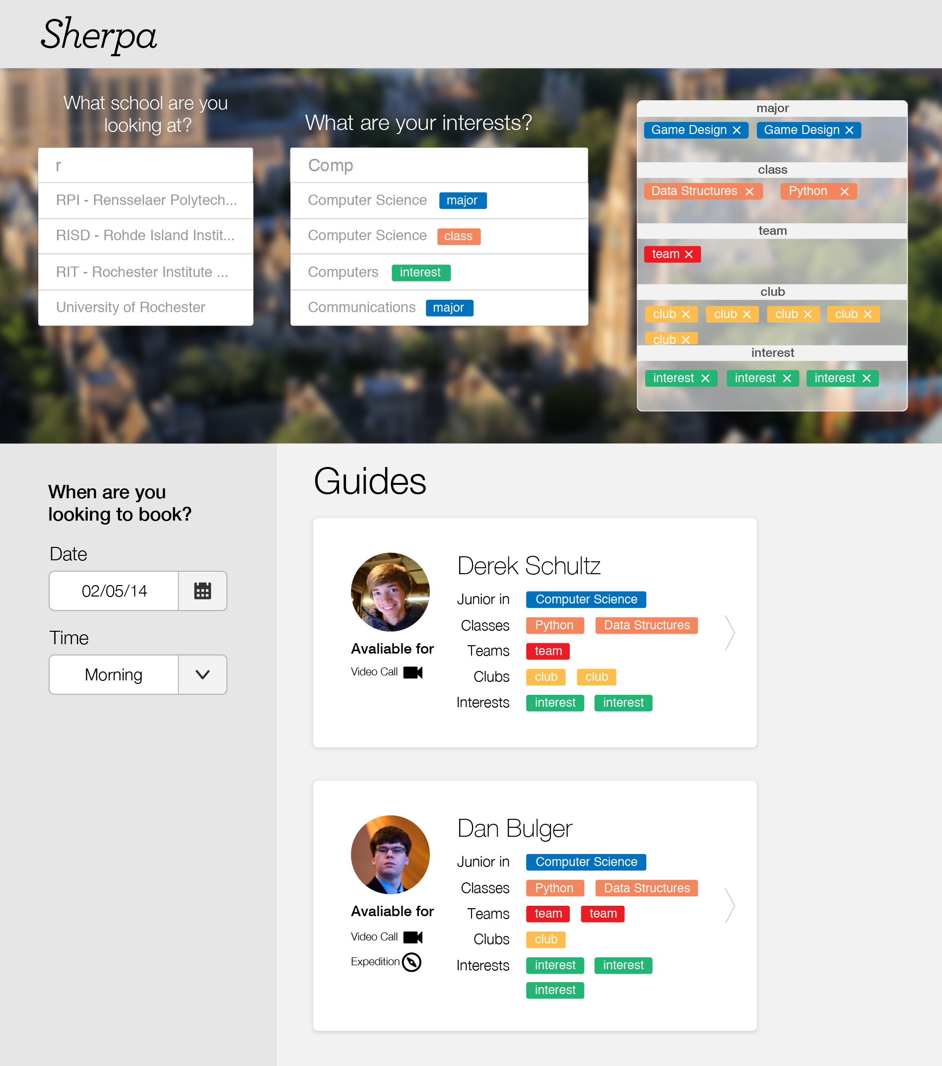
Changing schools
This page also features a brief profile of the school displayed under the school logo. It shows the number of registered sherpas as well the number of sherpas currently available for video calls. At the bottom of this module is a prompt asking if the user would like to look at a different school. Clicking this replaces the modules with another type-ahead, similar to the one on the landing page, allowing the user to select a new school to look at.
Booking a Sherpa
Besides filtering sherpas based on interest, a user can use the menus on the left-hand side of the view to pair down the list based on the date and time they are available. Once the user finds a sherpa they are interested in, they can click on a sherpa card which will direct them to the view for booking.
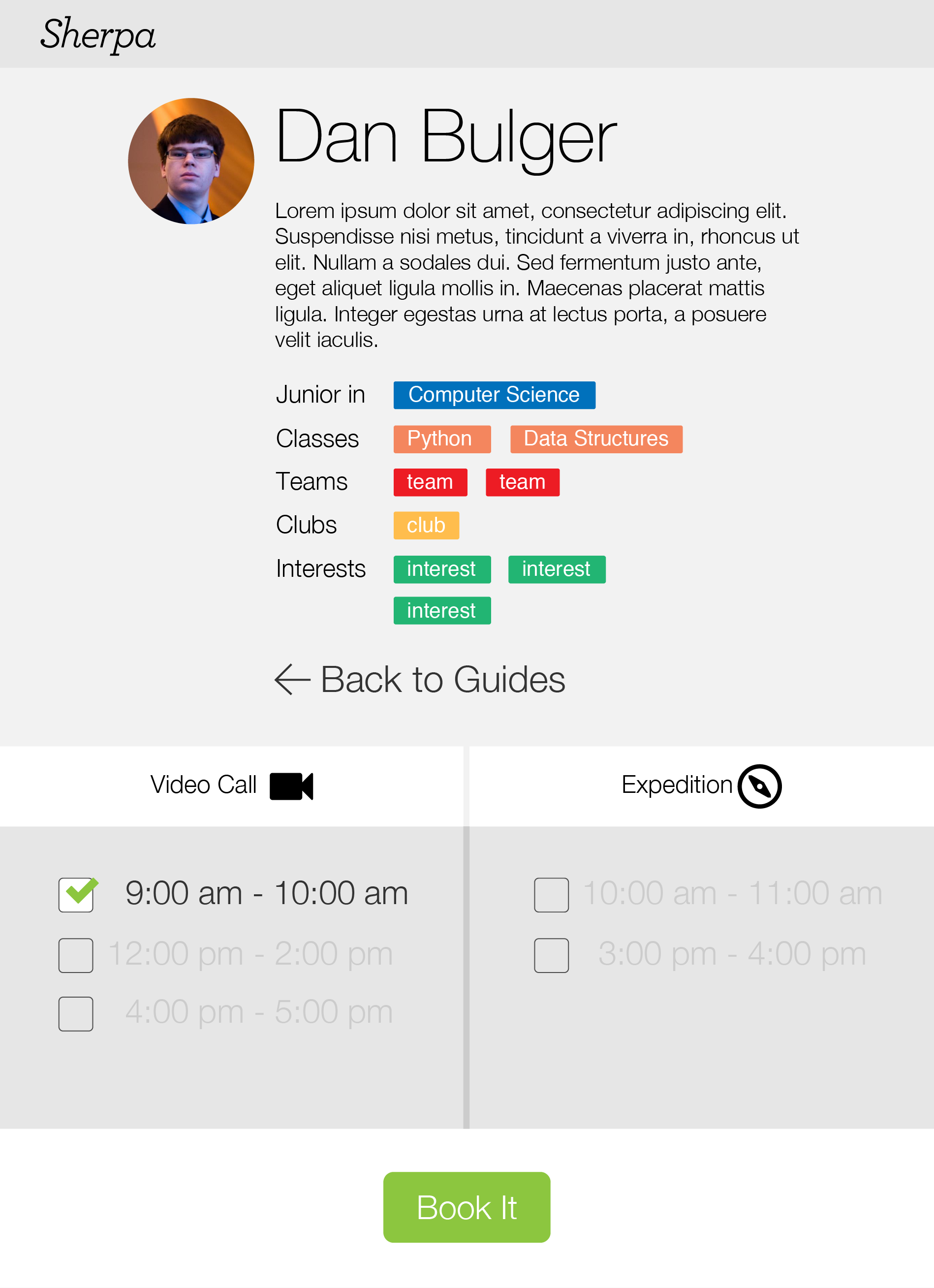
In this view users book a date and time for their sherpa meeting.
This view contains a bio provided by the sherpa as well as an overview of their interests, as was on the sherpa card. At the bottom, the user can choose from a list of times for a video call or expedition. If the user didn’t choose a date in the previous view, the app will show times for the week with each list of times delineated with a heading containing the day of the week.
Once the user selects a time, they click “Book It” and are asked if they’d like to add the event to their calendar. At this point the app schedules an event in the sherpa’s calendar and notifies them of the booking.
Results
Though we ultimately did not place at this hackathon, we did achieve our goals of demoing in-app calling and building in Google Calendar integration. Despite a lot of frustration, it was an incredibly fun and satisfying experience working so intensely with my friends to design and build this app in 24 hours.