CDTA Mobile Experience
Redesign of the mobile web experience for the Capital District Transportation Authority.
view the design doc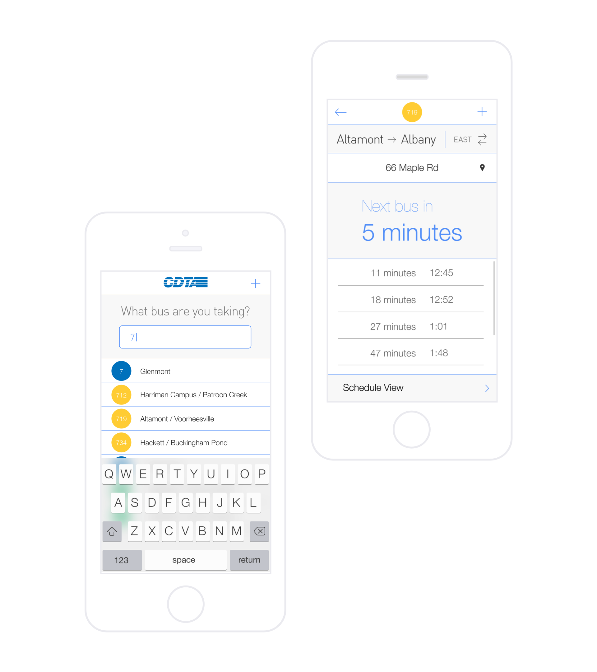
In the winter of 2013 I was recruited by Troy Web Consulting to help respond to a request for proposal for a redesign of the web experience for the Capital District Transportation Authority. I worked with one other designer, Trevor Phillippi and mostly owned work on the design of the mobile experience.
The Process
looking at the data
The CDTA provided us with analytics data from their current website and mobile apps which served as the basis for our designs. Just a quick look at the data seemed to reveal some significant use patters. First of all we noticed that the majority of users were visiting the website on mobile devices and that the number of mobile visits had been steadily increasing month per month. More significantly though, we were able to see that a vast majority of people visiting the site on mobile were navigating specifically to the section of the site that contained scheduling information. Furthermore, people were eschewing the interface the site currently had for looking up routes and schedules and instead opting to view a PDF of the route’s schedule. This information set the direction of our strategy for the proposal and ultimately the proposed designs we created.
Making informed assumptions
As a user of the CDTA bus system myself I knew first hand how difficult it was to access bus schedules. I have not-so-fond memories of pinching around a PDF on my phone in the freezing cold of an upstate NY winter night, trying to figure out if the bus I was waiting for was going to come before or after I froze to death.
The data showed that many people were likely having similar difficulties and so we decided to focus the mobile section of our proposal on showing how we would handle the experience of looking up a schedule for a specific route.
But we still had some questions that the data couldn’t completely answer. Who was looking for this information? where were they when they were doing it? why? where else could they get this information?
We felt we needed to at least consider these questions to come up with a really compelling design that made this information truly accessible. So we created personas — a young mother, a student, a middle-aged state employee — and we imagined various situations in which they would be using the CDTA and potentially looking for scheduling information.
We gleaned some important insights from this exercise that now seem fairly obvious. For one thing we realized that many who people who patronize the bus system have a few specific routes that they are familiar with; they know the stops the bus makes and generally how frequently one comes. They’re not looking to plan a route (a feature the CDTA wanted to highlight on mobile), they know where they’re going and how to get there.
What people do need to plan is their time. When to check out at the grocery store so you still have time to catch the bus. When to catch the bus to avoid being late to a meeting. People need to know when their bus is coming and often they need to know quickly.
With this knowledge we set out to design a mobile experience that satisfied the CDTA’s desire to maintain content parity between their desktop and mobile site while also lowering the friction of accessing critical content as much as possible.
After some sketching and wire framing we were ready to make a proposal.
The Proposal
We re-imagined the CDTA website as a product, focused on utility, that would enable users to access the information they need most with as little friction as possible.
Home
We designed the homepage with an emphasis on making the process of finding out when a specific bus will arrive at a specific stop as smooth and simple as possible.
The design achieves this low level of friction by first orienting the user to the overall product and then immediately prompting them to take action. The first thing a rider of a bus has to decide is which route to take, so this is the first thing the site asks them to fill out.
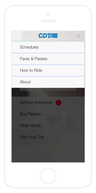
The design maintains the basic organizational structure of the site as viewed on a larger screen. Primary navigation is collapsed into a drop-down menu accessed by tapping or clicking on the plus in the upper right corner. Other links are collapsed into a list view. This content is prioritized based on how much the information could potentially impact a rider’s actions.
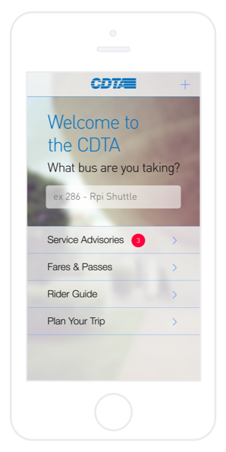
We designed the homepage with an emphasis on making the process of finding out when a specific bus will arrive at a specific stop as smooth and simple as possible.
Selecting a Route
Once the user focuses in on the text field it is animated to the top of the screen, the background solidified and a list of all CDTA routes filled in. At this point the user could decide to type nothing in the field and scroll through the list to find the desired route or begin typing the route name or number which would filter the list based on relevance.
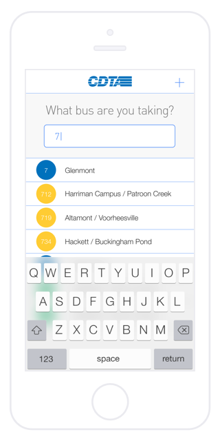
Once the user focuses in on the text field it is animated to the top of the screen, the background solidified and a list of all CDTA routes filled in.
Next Bus View
Once the user selects their route they are brought to this view, which is designed to most efficiently communicate to the user the information they are most interested in: how much time they have until the bus arrives at the stop they are at (or on their way to) and when the buses after that will come.
In order to reduce friction in the process of delivering this information, the site uses the geolocation API to initially show the user information for the bus stop they are closest to while also predicting the direction in which they are traveling. If the use of this API should fail or if the user is interested in a stop that they are not close to they can tap on the stop name to bring up a list of all the stops from which they can select the one they’re interested in. The user can also easily toggle the route direction by tapping the direction label above the stop name.
From the bottom of this page the user can access more general schedule information for weekdays and weekends.
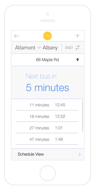
Once the user selects their route they are brought to this view which is designed to most efficiently communicate to the user the information they are most interested in how much time they have until the bus arrives at the stop they are at or on their way to and when the buses after that will come.
Selecting a Stop
When the user taps on the name of the stop, a list of all the stops on that route is shown with the background greyed out to preserve the user’s sense of place within the site.
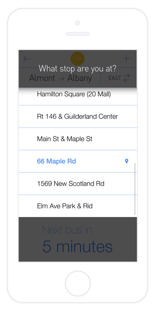
When the user taps on the name of the stop, a list of all the stops on that route is shown with the background greyed out to preserve the user’s sense of place within the site.
Schedule View Menu
Some users may want to access more general schedule information for a future date or time. Tapping on “Schedule View” expands a menu giving the user access to schedule information for weekdays, Saturday and Sunday. We chose to give weekday schedules the label “Mon - Fri” as opposed to “weekday” to quickly differentiate it from “weekend”, because it is easier to map a range of days to the current day of the week and to keep the naming convention consistent i.e. naming the day instead of classifying it as weekend or weekday. This further reduces friction of use.
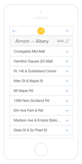
Some users may want to access more general schedule information for a future date or time. Tapping or clicking on “Schedule View” expands a menu giving the user access to schedule information for weekdays, Saturday and Sunday.
Mon - Fri Schedule
To provide users with the best experience of viewing schedules on a small device we knew we had to eschew traditional tables as they require too much imprecise pinching and swiping. At a given time users are generally only interested in a single specific stop-arrival time pairing.
By collapsing the list of times at which a bus arrives at a stop under the name of the stop we streamlined the process of looking up arrival times, allowing the user to see all the arrivals for one stop at a time.
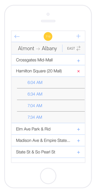
To provide users with the best experience of viewing schedules on a small device we knew we had to eschew traditional tables as they require too much imprecise pinching and swiping. At a given time users are generally only interested in a single specific stop-arrival time pairing.
Conclusion
The CTDA loved our proposal and we got the opportunity to meet the members of the CDTA team and pitch the proposal to them in person. Unfortunately they ended up giving the project to another firm, citing budgetary restrictions.
Though it was disappointing that our designs didn’t get realized, working on this project was a tremendous experience and one of the most valuable design challenges I’ve undertaken.